People all around the Internet were praising DiRT
Rally for its realism and unforgiving rally driving
experience. When trying it, a couple of minutes into the game, I hit huge rock
at high speed, my car rolled over several times until stopping upside down. A
message popped up saying something like press enter to recover vehicle, which
I did, and then I was instantly back to the road, ready to keep racing. Instead
of killing the virtual me, the game merely gave me a 15-second penalty. Come on,
are they really calling this nonsense a realistic simulation?!
Step 1: Accelerate to 140 km/h. Step 2: Hit a power pole. Step 3: Keep racing.
Often, looking at these nonsensical things through the perspective of game
design helps to transform some whys in becauses. In my interpretation, this
particular case is related with the concept of skill range. More specifically
this is a nice example of reducing the skill barrier of the game.
Skill Range
Every game is designed with certain skill levels in mind. When designing a game
for children or casual players, you want a very low skill barrier, meaning
that even very unskilled players can handle it. But that’s not the case of DiRT
Rally: this is a game designed for competitive, highly-skilled players. In my
few attempts to race in online events I was flabbergasted by the ridiculously
fast times ⚡ ⏲ the top players attain (and by the way, most of them seem to own
racing wheels and pedals that cost more than my whole computer!). For this
target audience, it makes all the sense to design for a very high skill
ceiling. This is how you keep even the most talented and dedicated players
motivated to play one more time: they feel they haven’t perfected their skills
yet, they know they can achieve an even better performance.
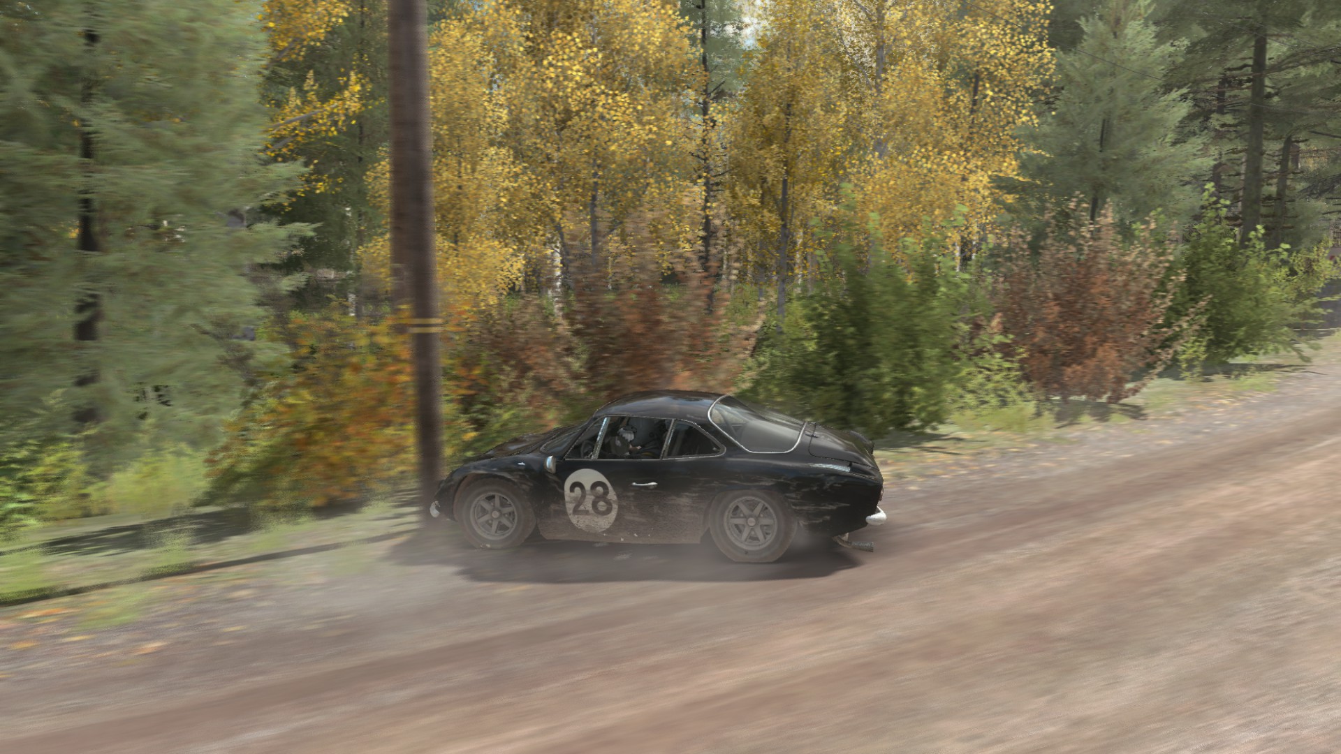
And this is exactly what DiRT Rally does. The driving part of the simulation is
truly realistic. Add some challenging tracks, some gravel, ice and snow ❄️, some
trees 🌳 🌲 and rocks just outside of the road and you get, indeed, an
unforgiving game: even small mistakes can end up in an accident. The design is
clearly optimized for the top-end of the skill spectrum. As I just said, this
makes sense for this game, but also brings a big risk: the game can turn out to
be too hard and frustrating for beginners. If the damage simulation in DiRT was
as realistic as the driving simulation, only those who can drive in real rallies
would ever finish a stage. And that would be bad, because there aren’t too
many rally drivers in the world and the game would probably flop!
Now this is starting to look like a beautiful design: DiRT Rally offers an
unforgiving driving experience for the top players but a quite forgiving
crashing experience for the rest of us. For a top player, the 15 seconds they
get as punishment for a crash are an eternity. A top player that loses 15
seconds is completely out of his challenge. Fifteen seconds or an exploding
car 💥 are not much different: in both cases, it’s pretty much game over for
them. But it is not game over for the less skilled players. Those can still
return to the race and still hope to finish the stage with a good time (for
their standards). Perhaps more importantly, they’ll keep racing and improving
their skills. Having an increasing number of highly skilled players can only be
a good thing for a game that targets this audience.
For sure, I am not one of these highly skilled players DiRT Rally was made for.
Nevertheless, I feel great whenever I manage to pull of one of those cool
rally-style, sliding turns. Had this game realistic crashes, I would have given
up before I had this pleasure even once. In summary, adopting an unrealistic
damage model, the designers reduced the skill barrier without compromising the
skill ceiling. They widened the skill range without harming their main target
audience.
Visual Hierarchies and Control Mapping
Two more quick design-related comments about DiRT. The first is about how tricky
creating visual hierarchies can be in practice. In a first look, the game
appears to implement a good visual hierarchy, with the most important things
appearing with more prominence:
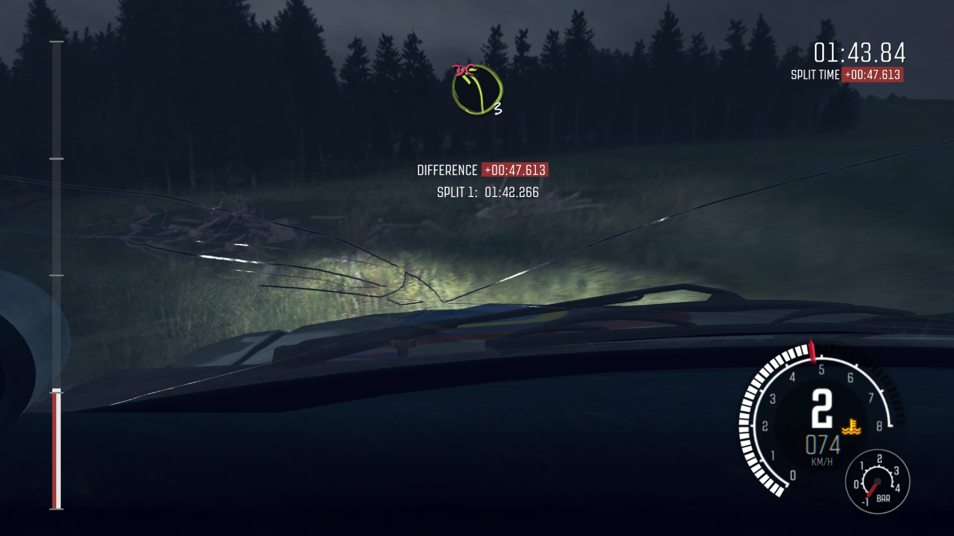
The most important thing in the game is the road ahead, which fills most of
the screen.
The next most important thing are probably the co-driver calls. These are
delivered through audio, but also as icons appearing in the center-top of the
screen.
Then we have other useful (though not critical) information, like the
speedometer, tachometer and some indicators of how well the player is doing.
These are placed in more peripheral positions around the screen borders.
Finally, we have information that is relevant only at certain moments, like
the times for the intermediate timing points. These are hidden most of the
time, appearing only when they are most useful.
So far, so good. However, for me, playing this game requires absolute
concentration (so many times I caught myself thinking about any random stuff and
a split-second later I was hitting a tree). And it turns out that most the
information on the screen only distracts me. Those intermediate timings popping
up on the screen are especially disastrous. “Wow, look at this! I’m doing good!”
Crash. 👎
Too much distracting information on the screen. No wonder I went off-track!
That said, this is all very particular of my own experience. I suspect that
better players can cope much better with all these things. The lesson for me is
that even a visual hierarchy that looks well-designed can actually fail in
practice for some players. And by the way, Paul Coleman and the other DiRT
designers seem to be aware of this, as they allow players to enable or disable
each of the visual indicators as they want. 👍
Finally, a very brief and kinda obvious comment about control mapping. While a
game like this is better played with a steering wheel controller (virtually
one-to-one control mapping), we can also play with a game pad 🎮. And when using
a game pad, by default, the throttle is mapped to the right analog trigger and
the break to the left one. Just like the pedals in a car.